
Start with the day-to-day problem.
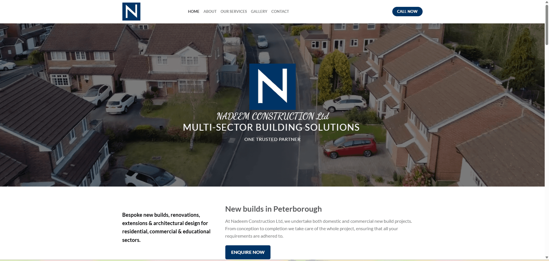
A construction website needs to introduce the business to visitors with very different projects in mind. A homeowner planning an extension and an organisation considering a commercial building may need different services, but both need to understand the company’s scope and how to begin a conversation. The visible homepage addresses this challenge by combining an overarching building-services message with a more specific introduction to new builds in Peterborough.
Give the experience a clear structure.
The opening uses an aerial residential image, a prominent N identity and a multi-sector building message to establish the company’s presentation. A compact navigation offers About, Our Services, Gallery and Contact, with a separate Call Now action. Below the hero, two columns connect the breadth of the offering with a local new-build introduction and an Enquire Now prompt. The layout moves from brand recognition to service scope and then to an enquiry.
The details behind the interface.
A recognisable construction identity
The navy-and-white N mark appears in both the header and the opening visual. The aerial residential image gives the page a building context, while the company name and multi-sector message make the purpose of the website immediately apparent.
Breadth expressed in plain service terms
The visible introduction names new builds, renovations, extensions and architectural design. It also identifies residential, commercial and educational sectors, giving different prospective clients a way to recognise that their type of project belongs in the conversation.
Local relevance beneath the brand message
A dedicated new-build introduction names Peterborough and describes domestic and commercial projects. This grounds the broader positioning in a local business context without requiring the visitor to search for a separate location page.
A short route to an enquiry
Call Now is placed in the header and Enquire Now beside the introductory project copy. These visible actions support visitors who are ready to discuss a project, while the service and company navigation remains available to those who want to explore further.
Room for company and project information
About, Our Services and Gallery appear as distinct navigation destinations. Their placement creates a straightforward information structure for learning about the company and exploring its work before making contact. This case study describes the visible homepage and navigation rather than unobserved content on those pages.
A clear introduction to the business and the next conversation.
The homepage gives Nadeem Construction a clear public introduction: a consistent visual identity, an explanation of its building-service scope and prominent enquiry prompts. The case study is grounded in the supplied homepage screenshot. It does not claim measured enquiry growth, completed-project volumes, verified accreditations or features beyond the visible website experience.
Discuss your project goals